Tuesday, 27 January 2015

Wednesday, 7 January 2015
Questionnaire
When I present my music video to a wide array of people in late January, I ideally wish for their feedback. However I thought it would be a good idea to create a simple but very helpful questionnaire before hand to see what people prefer in a music video in general before creating one specifically to my video. I originally created it on Microsoft PowerPoint:


However, although this looked appealing, it was not really in keeping with the manner of which a media student would create a questionnaire. Therefore I decided on presenting it as an online questionnaire on 'SurveyMonkey':

However, although this looked appealing, it was not really in keeping with the manner of which a media student would create a questionnaire. Therefore I decided on presenting it as an online questionnaire on 'SurveyMonkey':
The questionnaire is available below:
Create your free online surveys with SurveyMonkey , the world's leading questionnaire tool.The Making of my Digipak

Bottom Left (Track List) - Although only one song is required to be chosen for my music video, I added in some random sounding song titles for my genre. In the bottom right corner, a barcode and an 'Warner Music Group' logo can be found. The background is of the setting where a majority of the first half of the video is shot, I then used the greyscale effect (and darkened the image) in order to keep it in theme with the genre of the digipak. Afterwards the image was put with the titles and symbols to create the track list.

Bottom Centre (Album Cover) - So the my advert and digipak could be easily associated with one another, I decided to use the same fonts and background from the advert on my album cover. The only difference is that I condensed the background and have only kept in the artist and album title.
Bottom Right - This image was mad simply by scanning a lever-arch file and then putting up the contrast
Top Left (Booklet Sleeve) - I copied the image I got from scanning the folder, and I used the background and fonts that I used for my advert and album cover. However I used Adobe Photoshop yet again to erase just over half of the image in order for it to resemble a booklet that could be found in a digipak.
.png)
Top Centre (CD holder) - The CD itself is composed of 2 circles simply created in Microsoft Publisher which I filled with black, yet made the centre piece transparent in Photoshop. The letter 'O' simply stands for Onyx which I gave a white glow to it for it to look more appealing on the CD. The picture in the background is simply instruments that fit the genre of my band, with some amps (all from my college's music department).
.png)
Top Right (Picture relating to CD) - This is a picture of a man in the distance of a very isolated road in order to connote just how alone he feels. I added the black and white effect to the picture as I believe that it would display to the audience that the music featured in the digipak is that of a deep and emotional nature.
Tuesday, 2 December 2014
The Making of my Advert
I started off my creating an initial layout on Microsoft Word. This was a pretty straightforward layout with simply various fonts and colours. The majority of the work was then done in Adobe Photoshop.
I decided on a red and black background because it would both fit my genre as well as looking really appealing. In this particular case, I was inspired by some general backgrounds that are desktop wallpapers more so than previous bands adverts:


The different shades of black and grey were created by creating different sized shapes in Microsoft Word, and then then by altering the shades of grey and black, I was able to create the perspective that some are protruding more so than others, and so the first draft of my background was done.

I have previously used Photoshop, and therefore had a rough idea of how I was going to go about creating the background, however just to be on the safe side I thought it would be best to look up a video on YouTube of how to create a wallpaper (in my case, a background for an advert).
The man in this video had pre downloaded brushes to have a wild effect, whereas all I needed was simple lines of bright red. I used effects much like those seen 11 minutes and 40 seconds into the video to create the dashes of red, of course I made it so it is as if it is seeping through the black. Meaning that it seems more direct and subtle than how the video designed the wallpaper, it was a slightly different process as the pattern I needed to produce isn't as extravagant as seen in the video. I also believe that this would link with my song choice, because it could be viewed that there is a deeper, darker meaning to 'Boulevard of Broken Dreams', which when listening to the song there is.

I finished by to sharpening the overall image as well, giving it a glossy appearance and added a lens flare in the centre of the 'o' in Ragnarok. However it does not appear as much of a lens flare as I focused the light directly on the 'o'. 
I wasn't sure whether or not to have my final advert with the lens flare or not, so here's both:


Wednesday, 12 November 2014
Cast/Actor List
My music video will require 3 band members, one of which will also star as the main actor. There will also be various other actors playing much smaller roles.
Vocalist - Will Corrie

Guitarist - Daniel Bunn

Actor - Will Corrie
The props that will be required when filming in the studio will be nothing but the instruments, and the costume will be dark casual wear (such as jeans and a black top). I would like the actors to continue wearing dark clothing when filming outside (perhaps instead of black, a royal blue). However the props that would be required are more easily obtainable.
Vocalist - Will Corrie
Guitarist - Daniel Bunn
Actor - Will Corrie
The props that will be required when filming in the studio will be nothing but the instruments, and the costume will be dark casual wear (such as jeans and a black top). I would like the actors to continue wearing dark clothing when filming outside (perhaps instead of black, a royal blue). However the props that would be required are more easily obtainable.
Lip Sync Video
Before I started filming my music video, I undertook the task of taking a snippet of a song and editing it so the words that are being mimed fit perfectly. The song that was given to me and my group to film and edit was The Human League's 'Don't You Want Me'.
This was a rather straightforward task, however we were given a limited amount of time (2 hours) to record all of the footage and edit it in Adobe Premier. Another part of the task was to incorporate shots that reflect what the singer is saying, hence we included various shots of the girl the singer was referring to in the song.
What I learnt from this activity:
- How to cut down footage in order for it to fit perfectly with the song
- That seeking what you require to film can take more time than expected
- How to effectively use an array of effects on AAE
Monday, 10 November 2014
Location
My music video will be shot in a variety of places. These places will predominantly include, a path which is surrounded by trees, a darkened alleyway and an empty road with flat land for hundreds of yards around:
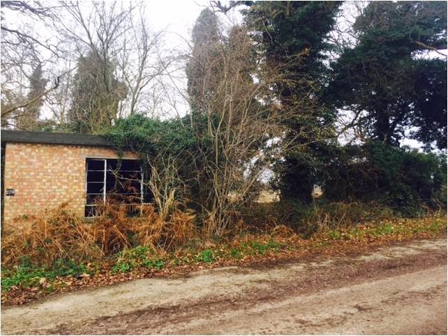 Woodland location: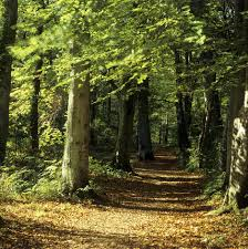
Darkened Street:

The first half of the music video (at least) will be featured in the rural setting of the trees and a small building amongst said trees, and a section of the second half of the music video will be featured in streets. There will also be a section of live performance which will be staged in a small studio.The video will then cut back to the rural setting at the end to see the main character drive off in his car.
Woodland location:Darkened Street:
The first half of the music video (at least) will be featured in the rural setting of the trees and a small building amongst said trees, and a section of the second half of the music video will be featured in streets. There will also be a section of live performance which will be staged in a small studio.The video will then cut back to the rural setting at the end to see the main character drive off in his car.
Sunday, 9 November 2014


Initial Design of a Digipak

Inside (Top)
Left
To the left of my digipak I have a simple slip case. The sleeve will not have any extravagant artistry or pictures, instead it will a very dark shade of red in order to match the colour of the band name
Centre
This is where the CD holder will be, with a picture of the instruments used in the music video behind it. Further indicating what type of music is on the disc
Right
This is a picture which relates to one of the most repetitive quotes in 'Boulevard of Broken Dreams' about walking alone. I have drawn him walking through woods to display just how alone he actually is
Outside (Bottom)
Left (Back Cover)
This is simply the track listing, the first track is the one I will be using, the rest are song titles that I have come up with to create the perception that it could be a genuine EP whilst still fitting the genre
Centre (Front Cover)
The word 'ONYX' dominates the front cover in a dark shade of red, whilst the album title 'Plagueis' (which I may change later) is written in a smaller and different style of font just below it in black
Right
As this will be on the inside until the album is opened, I have decided to leave this as a single shade of royal blue/black
Peer Assessment
- Instead of a mysterious man walking alone for the picture, my peer thought that it would be a better idea to have a picture of my band, and perhaps have the lone man on the outside of the cover
- Where there is the single shade of royal blue, there could be the picture of the mysterious man walking down a path (if the point above takes force)
Examples of Digipaks


Research of Advertisments/Advertisment of Band
Layout of Advertisement

My initial concept is of a picture of the band members (from the waist up) dominating about three-quarters of the entire advertisement (starting from the top). The band name would be what is written in the biggest font, followed by the title of the album and the fact its a debut album.

Peer Assessment
I did however talk with my peers about their opinion of my initial thoughts. Some of the feedback of ways to improve my piece includes:
- The band name could be across the middle of the band, instead of below them
- It could include 'Out Now' signs
- Include 'Available on iTunes'
Subscribe to:
Posts (Atom)